
Open any novel on your shelf. The paper isn't white.
About a year ago, I showed an early prototype of the note to a close friend. He's a director in the display organization at Apple. He knows everything about color, about how the eye works, how to tune a screen until it looks beautiful. At home, he doesn't keep a TV or many screens at all, because he knows how damaging and how addicting they can be for him and his young children.
He opened the prototype and asked why our paper was so white.
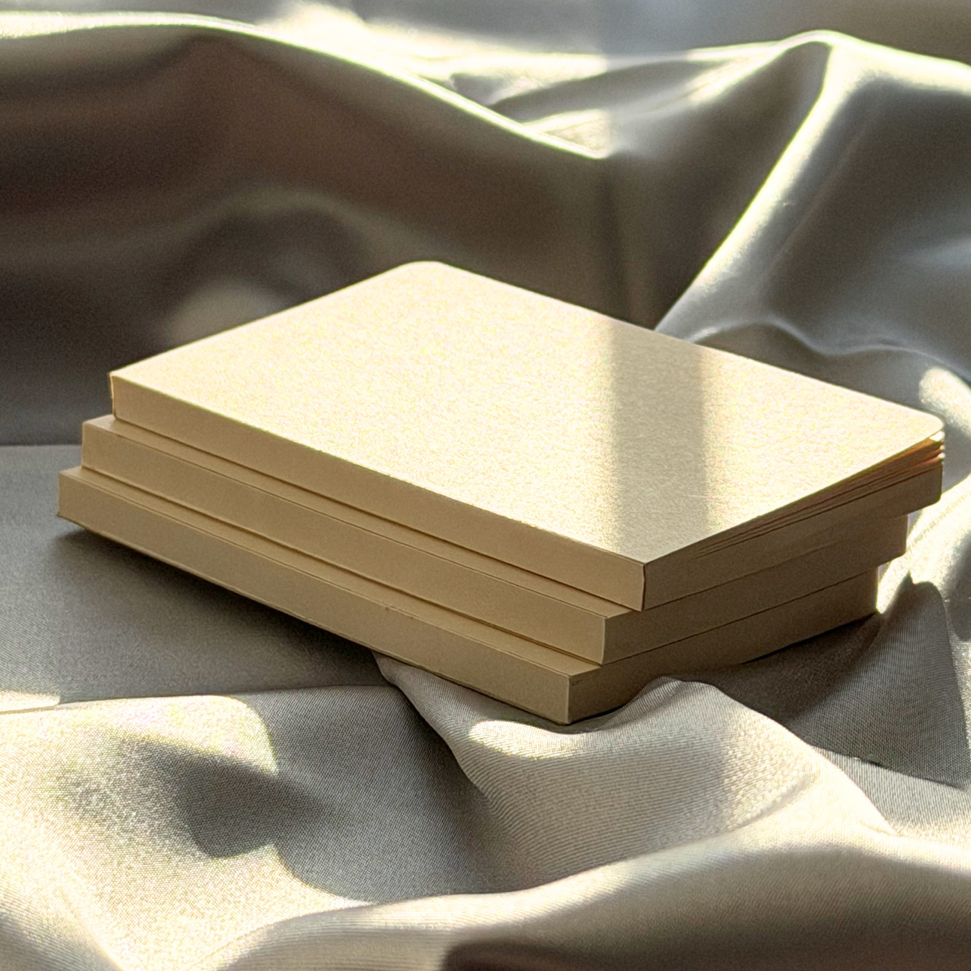
 Early Manufacturing Prototype of Gen1 SideNote
I was confused. Wasn't paper supposed to be white? He said, "The best reading paper is cream, or bone. It's easier on the eyes, easier to read over a long time, and it looks nicer."
So I went and looked. Open any novel, and you'll see it: the paper isn't white. It's a soft cream. They've done it that way for over a century, because bright white throws glare back at you and tires the eyes, and cream doesn't. White may look cleaner on a shelf, but cream is better for reading and writing.
I asked my supplier to swap the paper to a bone shade that week, and I haven't looked back. It's easier to read, and it's simply more beautiful.

If we want the people who carry our notebooks to be the authors of their own lives, the page they start from should be beautiful.